
ENHANCING PRESCRIBER ENGAGEMENT: MEDICATION REVIEW REDESIGN

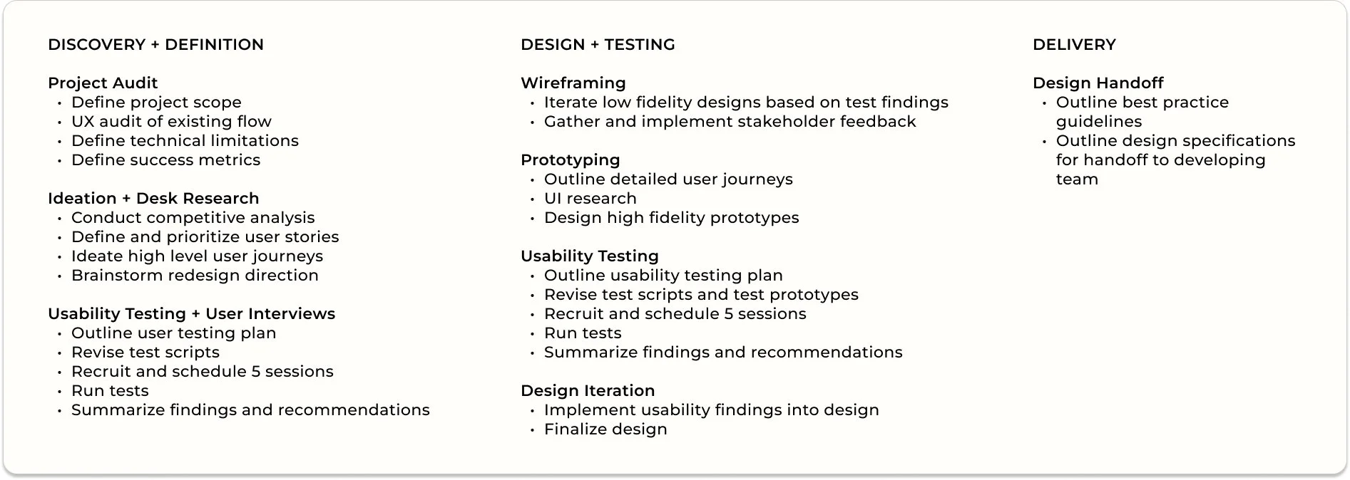
Timeline
6 Weeks
April - June 2023

Tools
Figma
Miro
Zoom
CMTR's unfriendly design causing low response and acknowledgement rates from physicians
Patient Problem
THE SOLUTION
THE PROBLEM
Physician Problem
Confusion around purpose of CMTR
Potential malpractice

Redesign the CMTR for improved clarity, enabling physicians to swiftly decide whether to accept or reject recommendations
Vision + Scope Alignment
Overview
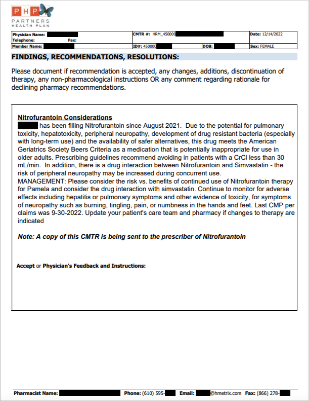
Partners Health Plan is authorized to review its members' prescriptions. Findings are then shared in the form of a Clinical Medication Therapy Review (CMTR) with a patient's physician.
Physicians are requested to either approve or reject the presented findings and recommendations
Role
UX + UI Design
UX Research
Content Design
Delayed medication adjustment
Potential safety concerns
THE TEAM
As the sole UX designer and researcher, I met with stakeholders to shape the redesign's vision, scope, and success metrics. Additionally, I led discussions around the project roadmap and identified key deliverables to ensure a comprehensive and aligned design process.
Stakeholders:
Medical Director
Operational Manager
THE RESEARCH
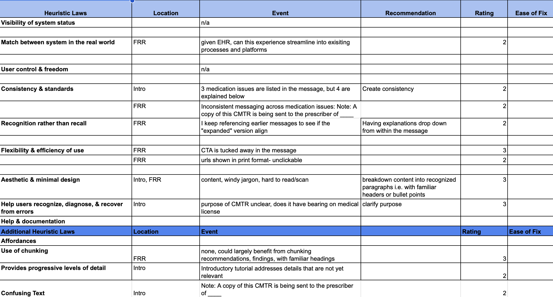
Heuristic Analysis
I then conducted a heuristic analysis to identify usability issues based on recognized heuristics and best practices.
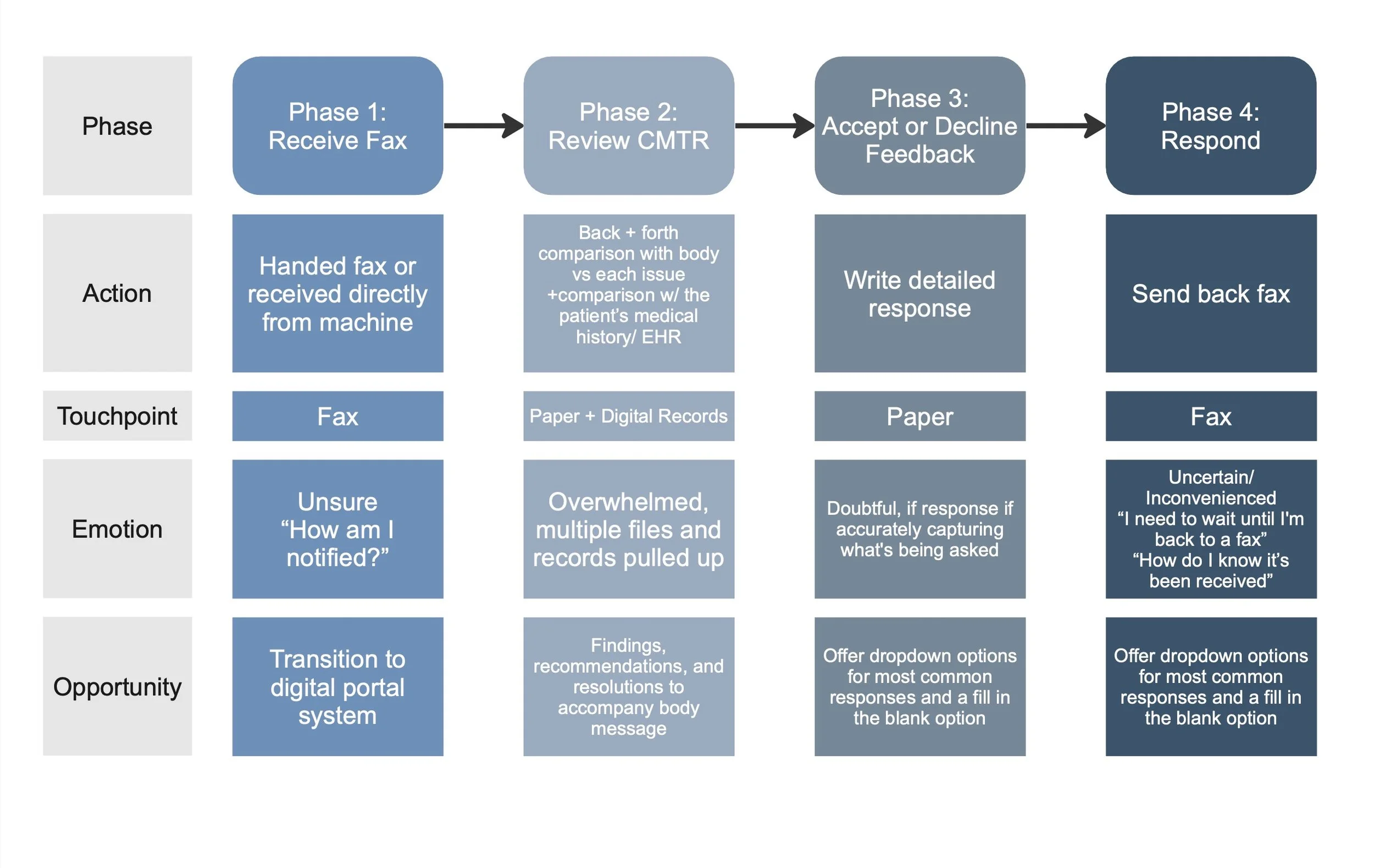
Workflow Analysis
I began by mapping out the existing CMTR process, highlighting bottlenecks and areas of friction in order to identify points where communication breakdowns commonly occur.
First Round of User Research
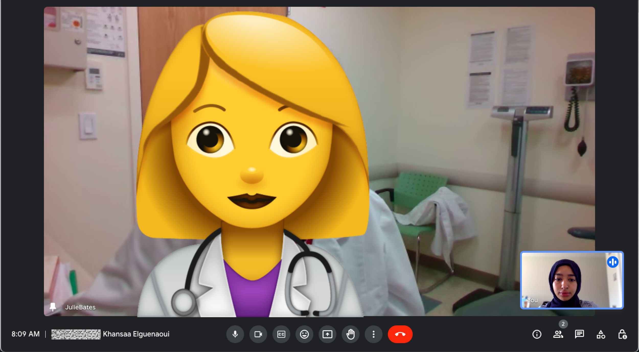
In an effort to identify key challenges that contribute to the low response rates, I met with 3 physicians and ran the first round of:
User interviews to gain insights into their daily routines, decision-making processes, and CMTR experiences
Usability testing, using the pre-existing CMTR to understand how they navigated the interface, reviewed mock medication requests, and the flow's overall usability and functionality.
THE IDEATION
Affinity Mapping
01.
Clarity + Simplicity
Given the busy schedules of physicians, prioritize clear and concise communication by removing unnecessary complexity and jargon. Ensure that information is presented in a straightforward manner, allowing physicians to quickly understand and evaluate findings.
From Friction Points to Resolutions
Findings from the first round of user research were then organized and synthesized to uncover patterns, themes and common pain points.
The affinity map was then presented to stakeholders, highlighting overarching issues and proposing actionable recommendations to address the identified challenges.
Design Principles

02.
Consistency
Maintain consistent design elements throughout the CMTR, such as headers, font styles, and colors. This fosters familiarity, reduces cognitive load, and promotes learnability of the system by providing a cohesive and unified experience.
RESOLUTIONS
01.
02.
Irrelevant Information
Participants were frustrated by irrelevant information.
Lengthy explanations and supplementary medication timelines distracted from the critical decision-making process, leading to user confusion and impeded workflow.
01.
Irrelevant Information
Decision-Centric Information
Streamline content within the review, eliminating non-essential explanations and keeping the focus on information directly contributing to the decision-making process.
Succinct Summaries
Empower physicians with an at-a-glance understanding of the issue, promoting faster decision-making.
Irrelevant Information
02.
Poor Scannability
Participants reported difficulty in quickly extracting pertinent information from the review interface. The lack of clear visual hierarchy and grouping made it challenging to identify essential details, slowing down the decision-making process.

03.
FRICTION POINTS + FINDINGS
Unclear Call to Action (CTA)
Participants found it challenging to identify the appropriate action to take. Furthering the confusion around the purpose of a CMTR and implications of a response.
Irrelevant Information
Action-Oriented Language
Each CTA should be carefully chosen to convey a sense of urgency and action, encouraging immediate engagement.
Visual Distinction
Visibility and clarity should be improved. Position CTAs prominently within the interface, utilizing intuitive labeling and visual cues to guide users.
03.
Information Hierarchy
Utilize effective typography, grouping, and concise labels to enhance information hierarchy, enabling users to quickly scan and comprehend relevant details.
Visual Grouping
Related information was visually grouped together allowing users to scan and comprehend quickly.
Preference for Print over Digital
Initial direction was to transform the CMTR experience from fax-based to a digital platform. However, user interviews revealed a surprising preference for the existing fax system due to its benefits:
In an effort to streamline the physician's process, nurses often reviewed the CMTR first, highlighting areas of focus
The printed format allowed effortless annotations, particularly during team discussions
Platform fatigue discouraged physicians from having to access yet another digital interface for time-sensitive reviews.
Surprise Finding!


THE DESIGN
Mid-Fidelity Prototypes
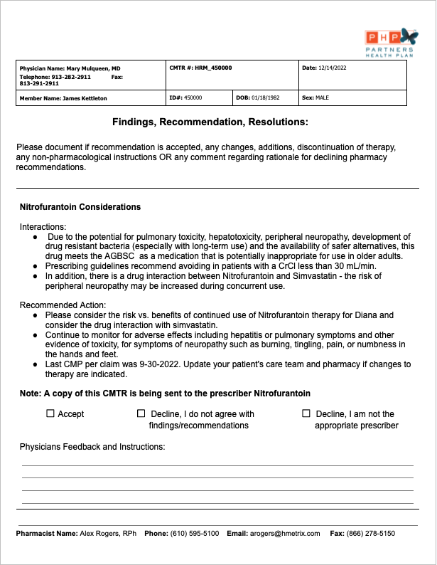
With the insights and recommendations in hand, I designed two prototypes*. They were presented to stakeholders in order to gather feedback and understand their respective limitations.
This iterative process allowed stakeholders to contribute their perspectives, refine the designs, and eventually reach a consensus on the optimal solution.
* All PHI has been censored or changed to protect patient data.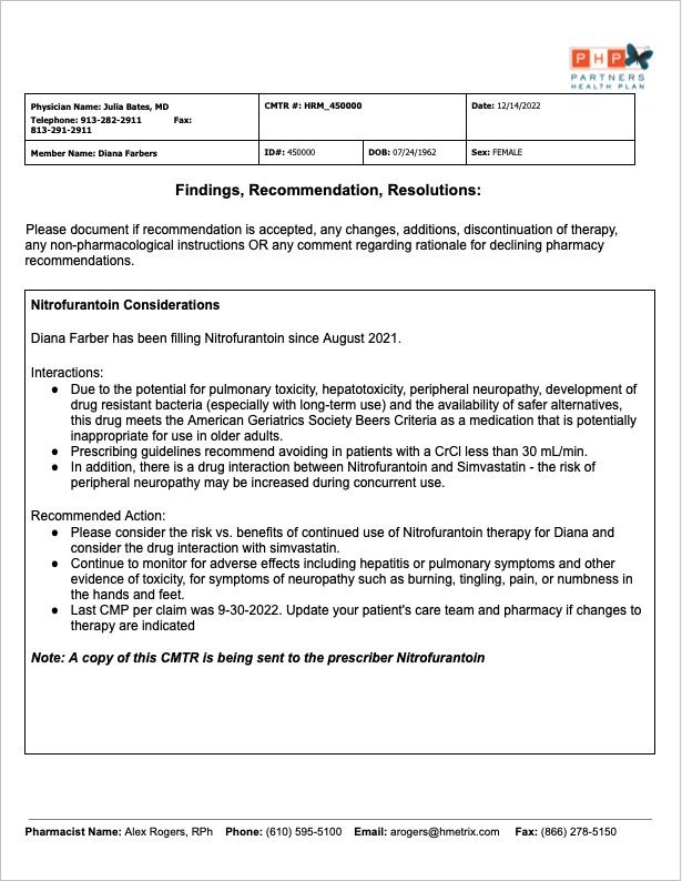
THE RESEARCH
ROUND TWO
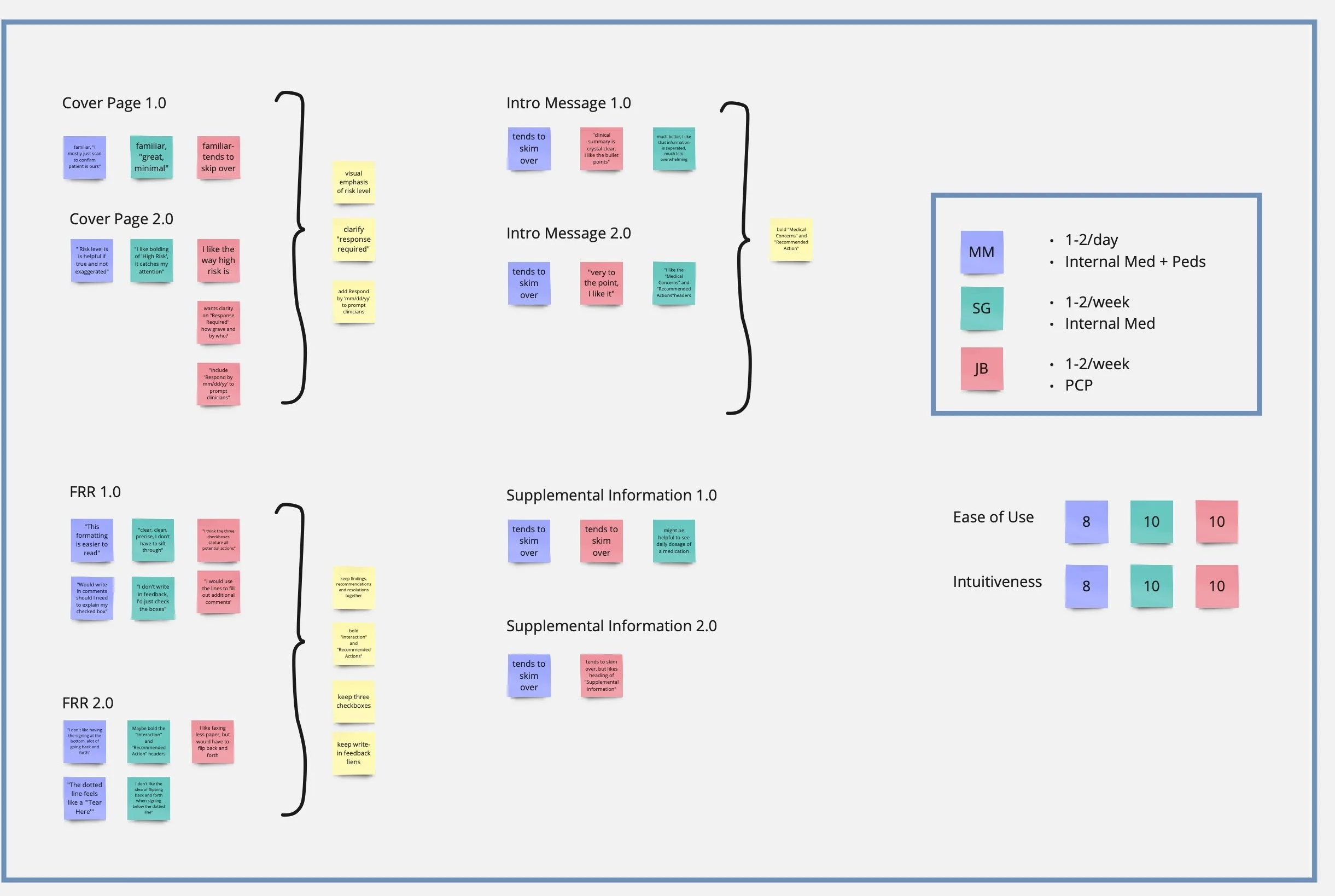
Usability Testing
With the redesigned mock CMTRs, I was ready to conduct a second round of usability testing to collect feedback on the proposed changes and make necessary adjustments.
Physicians interacted with both prototypes and shared feedback on their preferences as well as how the different layouts aligned with their expectations.

THE DESIGN
ROUND TWO
Hi-Fidelity Prototypes
Using user feedback as a guide, I refined the design, harnessing the strengths from each prototype.
This version was then socialized across stakeholders for feedback, which was subsequently integrated into the following high-fidelity prototype:
BEFORE


AFTER
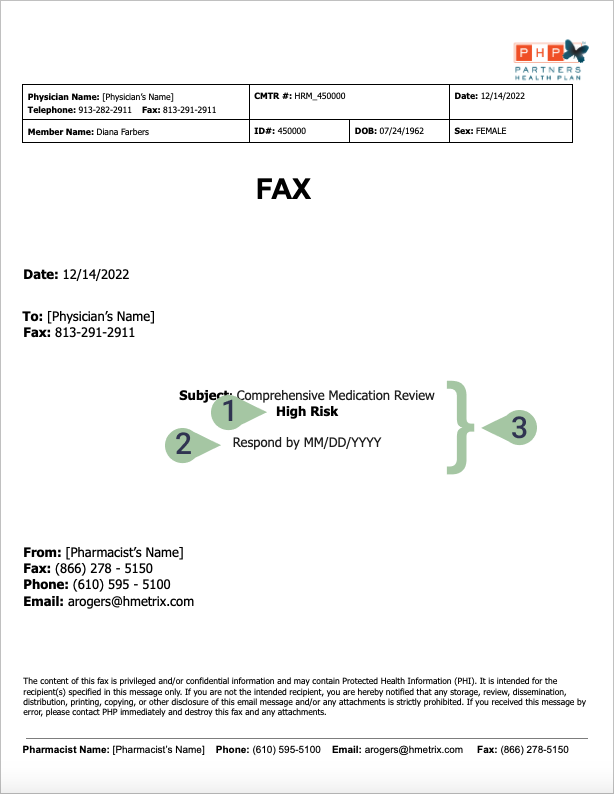
Added "Risk Level" to help physicians prioritize reviews by severity.
Added "Respond by" as physicians are less likely to delay responding when they see a finite time limit.
Center aligning pertinent information to aid visual hierarchy and scannability by drawing the physician's attention to a central focal point.

Chunking information aids readability and eases cognitive load by breaking content into manageable sections, allowing physicians to process information more smoothly.
Use of headers for common themes helps physicians recognize familiar patterns and provides a structured framework for information organization, thereby expediting the review process, and enhancing overall comprehension.
Bullet points aid scannability by presenting information in concise, easily digestible chunks, allowing physicians to quickly grasp key points.
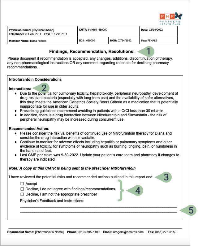
Maintaining uniform styling and alignment of headers to improve scannability and organization of content.
Use of headers for aforementioned reasons, as well as enhancing user familiarity and predictability, leading to improved learnability of the system and faster decision-making processes.
Included prompt to clarify what action is required and how to proceed.
Checkboxes encourage action by visually indicating selectable options, promoting physicians to interact and make choices, thus facilitating user engagement and interaction with the system.
Using lines for fill-in-the-blank areas prompts action by providing a visual guide for input, reducing uncertainty and encouraging user engagement.
NEXT STEPS
Training and Onboarding

To ensure a smooth transition to the new system, Partners Health Plan has taken the initiative to offer training sessions for pharmacists responsible for composing CMTRs.
To facilitate the process, I developed templates, crafted comprehensive user guides to help navigate the new system effectively, and established tone and language guidelines. These resources were designed to empower pharmacists, ensuring their comfort and proficiency in using the new system while maintaining consistency.
Measurable Success

Besides increased engagement, here are a few significant downstream impacts:
Improved patient care
Medication adjustments can be implemented more promptly, leading to improved health outcomes and potentially preventing medication-related complications.
Efficient resource allocation
Pharmacists can focus on cases where action is needed, reducing unnecessary follow-ups or delays in patient care.
Increased data quality
Increased response rates in medication reviews improve data quality, aiding in trend identification and process enhancement.
LESSONS LEARNED
Don't Assume User Preference
FINAL THOUGHTS
The surprising finding that some users preferred the existing fax-based system highlighted the importance of considering user preferences and familiarity when introducing new technologies. Even though a digital redesign might seem more efficient, users' comfort and established workflows can heavily influence their adoption of new systems.
Importance of Iterative Testing
Obtaining user feedback throughout the design process was crucial, especially in the absence of firsthand knowledge around medical processes. Given the niche audience, I had to acknowledge that relying solely on best design practices wouldn't always suffice.
Instead, gathering user feedback ensured that the redesign would align with the unique needs and workflows of the medical field, leading to a more tailored and effective solution.