

Timeline
4 Months
January - April 2022
Tools
Figma
Lucidchart
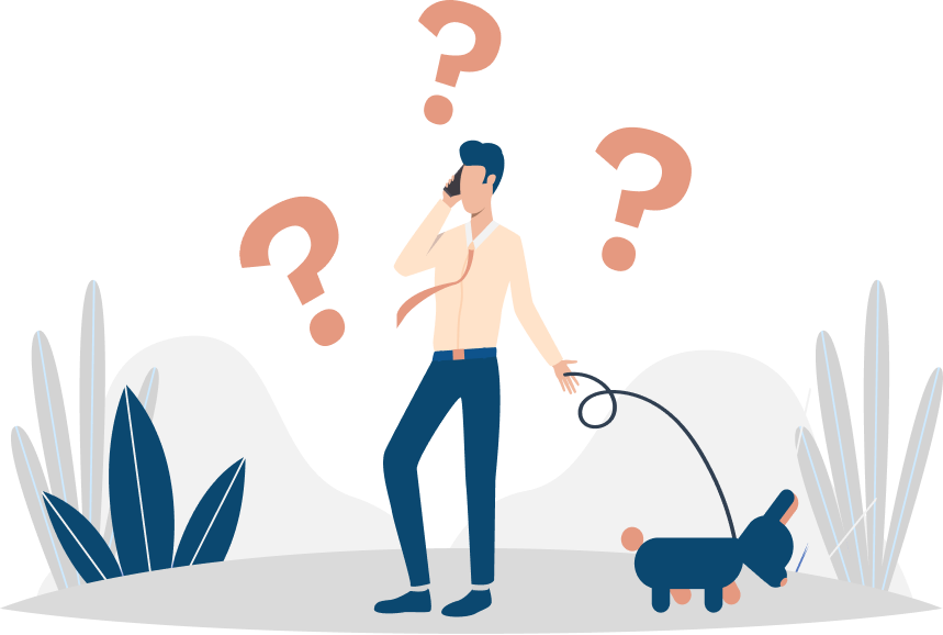
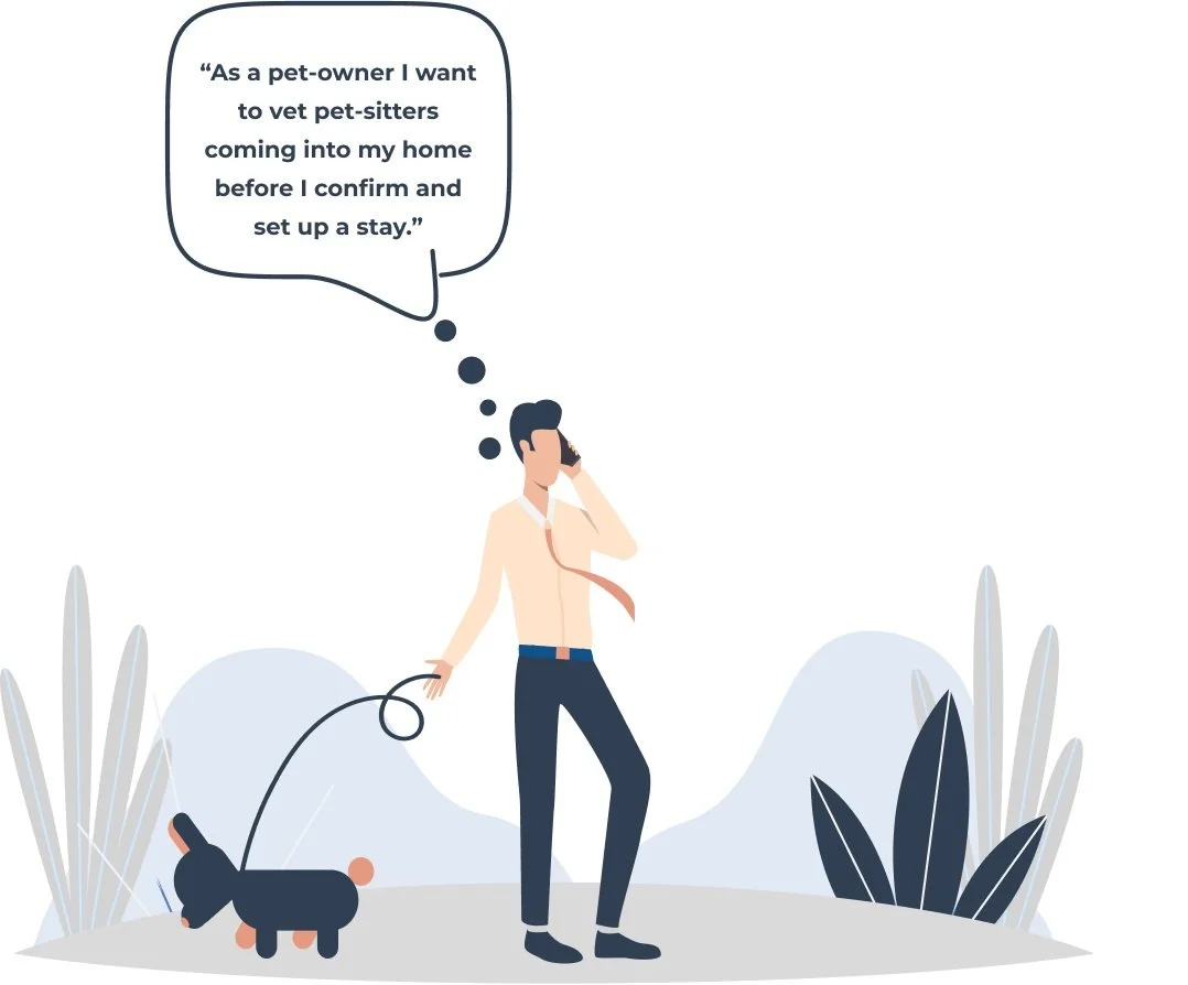
Pet owners lack trusted yet affordable pet-care.
Pet-owners are often discouraged from traveling, as leaving their pets behind carries its own planning complications and financial drawbacks.
THE SOLUTION
THE PROBLEM
Provide an engaging, yet informative onboarding template.
Overview
More than 23 million American households adopted a pet during the pandemic (ASPCA).
However, as people return to life in person, many pet-owners who want to vacation or take work trips are severely discouraged by the rising cost of pet-care/lodging and agree that pets are most comfortable in their own home.
So what’s the solution? PawBnb, a pet sitting community of pet-lovers who in exchange for looking after their fur-friends are given a place to stay, free of charge.
A win-win-win? I think so.
Role
UX + UI Design
UX Research
THE RESEARCH
User Interviews
To further define the problem space, user interviews were held at a dog park, where pet owners and pet-sitters provided crucial insight into common pain points surrounding pet care.

10 SUBJECTS
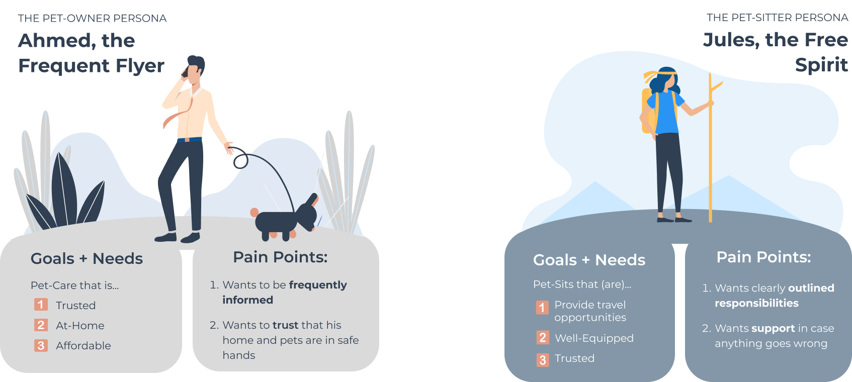
WHO AM I DESIGNING FOR?

Personas
THE IDEATION
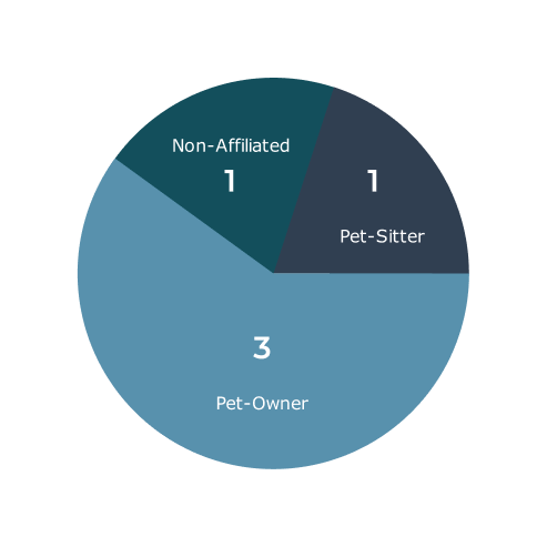
The data collected from the user interviews was then affinity mapped.
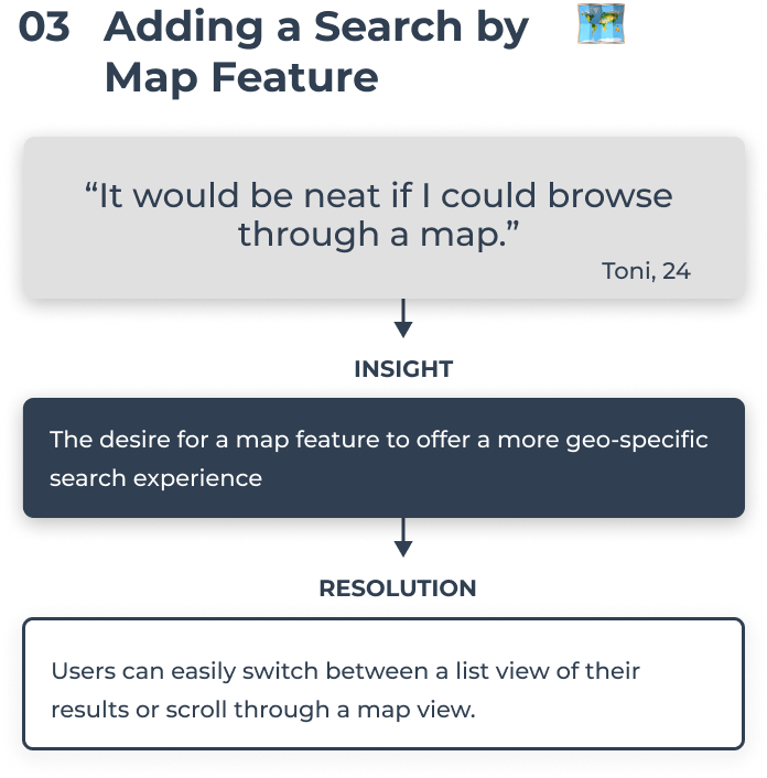
The following pie chart highlights the frequency of the three most common concerns and hesitations surrounding pet care.
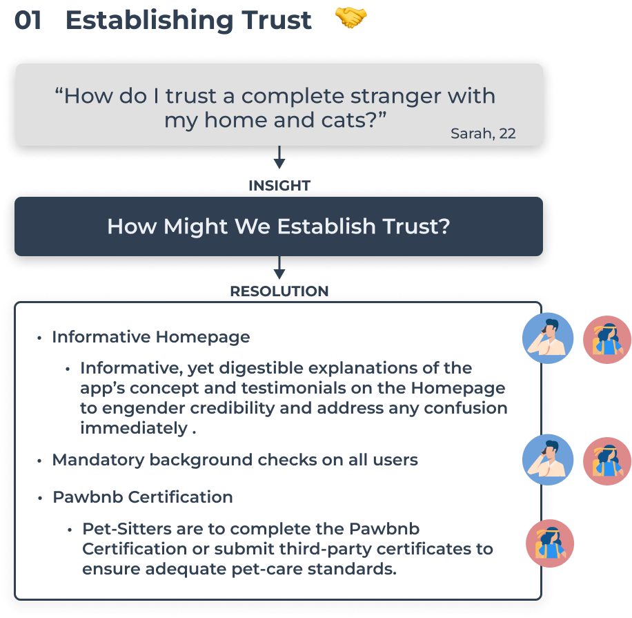
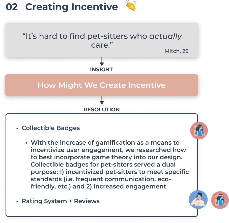
With the newfound insights, I began to brainstorm the “How Might We” questions below in order to incorporate corresponding features into our design.
Design Objectives
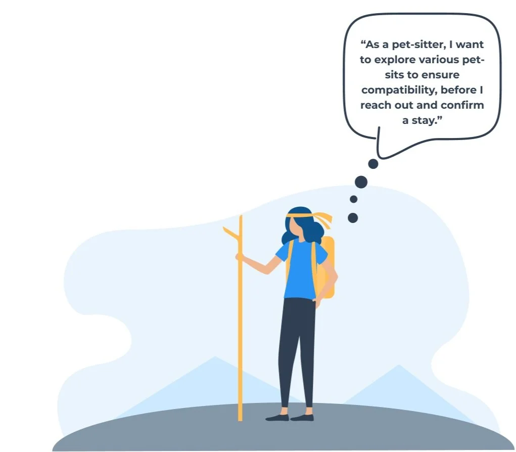
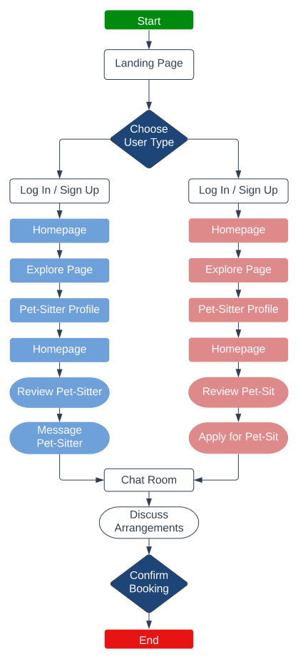
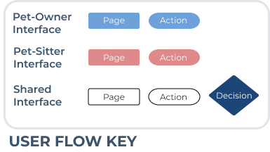
User Stories + User Flows


With the features and personas in mind, the following user stories and user flows were developed to highlight and define the scope of both use-cases.


WHAT AM I DESIGNING FOR?
Affinity Mapping + How Might We Questions
THE DESIGN
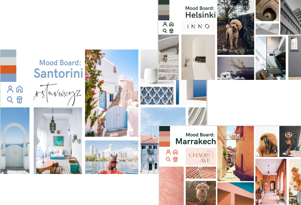
Moodboards
In an effort to hone my visual ideas I created mood boards that would serve as a visual guide to all design decisions, this way ensuring a consistent visual pattern throughout the app.
Although quite diverse, all three boards serve a different purpose and cater to different audiences.
Given the exploratory and fun nature of the app, I opted for the fresh, yet vibrant feel found in the "Santorini" mood board. The cool tones found in the blue, off-white, and gray help enforce the efficient and intuitive nature of the app, while the terracotta offers a warm and vibrant shade.
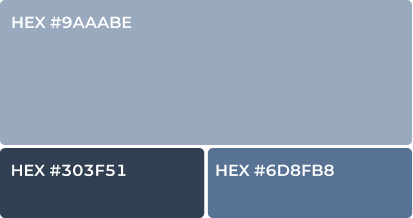
COLOR PALETTE
Why Blue?
Trust, being the defining brand character, I set out looking for how to best encapsulate it. Researching the topic, I discovered the wide usage of blue across sectors, where trust is crucial, such as financial services, healthcare, and security. Further research supported this notion, emphasizing that most people’s positive associations with the color blue stem from their perception of blue in the sky and sea, evoking a sense of security and permanence.
Why Terracotta?
Adventure, with trust established, it’s time to encourage adventure and enthusiasm. Terracotta, an orange with reddish hues, sits on the longer end of wavelengths, thus known for inducing higher levels of excitement.
The 60-30-10 Rule + Neutrals
While the blues and terracotta gave life to the app’s UI, they came secondary to the neutral palette highlighted above. It was crucial to use the 60-30-10 rule so that the app’s content would be emphasized by a neutral backdrop.
TYPOGRAPHY
Why Montserrat?
The geometric simplicity found in Montserrat further engenders trust and formality while maintaining legibility both within headlines and body text. Given the nature of the app, the font was not to distract from the content, thus Montserrat’s geometric nature captured just the simple, yet formal design desired.
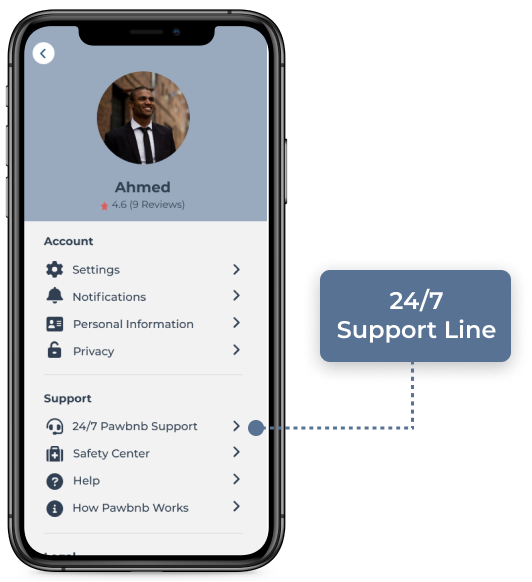
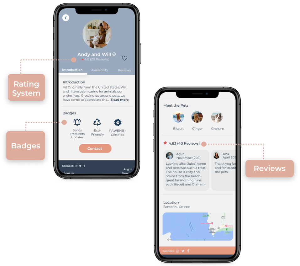
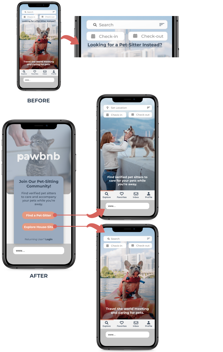
Wireframes
MID-FIDELITY
HI-FIDELITY


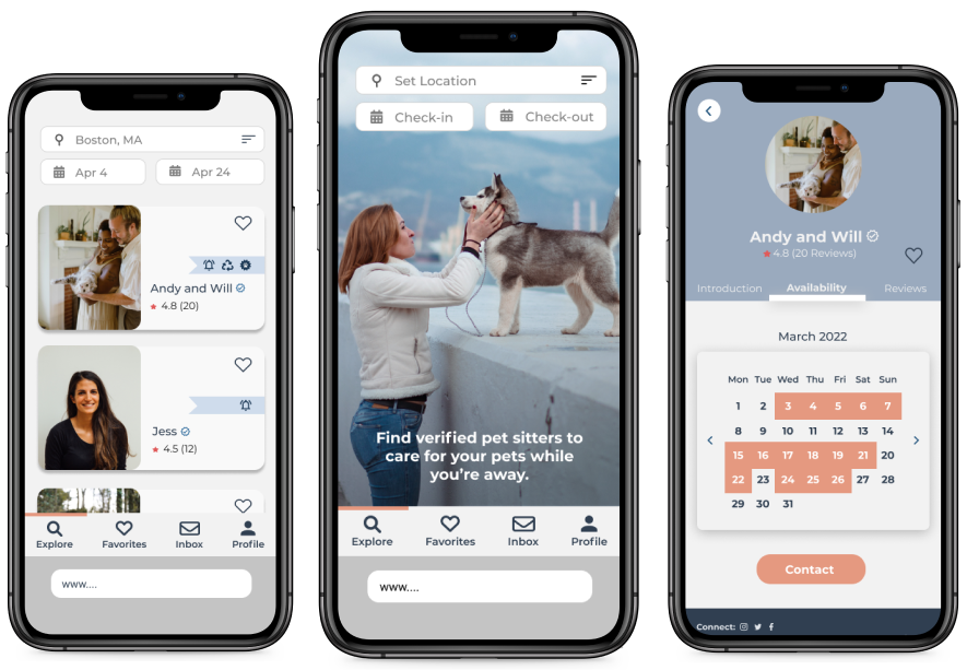
As the ideation phase began to cement the app’s concept, mid-fidelity wireframes were then designed on Figma. Using the design rationale, I began to design high-fidelity wireframes. While a few frames are showcased, a video demo of the full prototype can be found below.


THE VALIDATION
Usability Testing
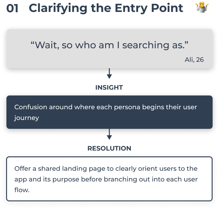
Using the mvp, I began usability testing in order to uncover general usability issues. I then prioritized our findings by the most common feedback received and by which ones ranked highest in severity (based on the Jakob Nielson scale).
KEY INSIGHTS
5 SUBJECTS


Pet-Sitter Prototype


Pet-Owner Prototype
NEXT STEPS
Design Handoff
Lastly, as the reiterations came to a close, I began standardizing common design elements such as colors, text size, fonts, spacing, etc. They were then inputted into the following style guide, which will act as a blueprint for all future design decisions.
Monitoring Success
Considering the cyclic nature of the design process, my next step would be to delve into a user's perspective of the app, by observing user analytics such as navigation paths and conversion rates. With such data, I can pinpoint usability issues and offer recommendations based on user needs.
LESSONS LEARNED
One Thing at a Time
FINAL THOUGHTS
Develop each persona's experience separately. Attempting to design for varying personas simultaneously only proved to overwhelm my ideation phase and discourage the overall process.
You Can't Skip the Research
This assignment focused solely on UI objectives. However, soon after beginning, I realized I would have to implement a research phase. This proved necessary because an app of this kind could not have been delivered without user feedback, specifically from the pet-care community.
I Haven't' Failed, I've Just Found 1000 Ways That Don't Work
After spending hours on a logomark, I was forced to scrap it after A/B testing proved my logotype to be far more preferable. Although valuable time was lost, it was a great lesson in remaining committed to user preferences and not my own.