
RESULTS PAGE REDESIGN

Timeline
6 Weeks
Sep - Oct 2022
Tools
Figma
Zoom
Conversion rate from those on the results page to those who assigned an activity was at 26%.
Business Problem
THE SOLUTION
THE PROBLEM
User Problem
Cognitive Overload
Unsure How to Browse Effectively
Low Satisfaction
Provide an intuitive search experience for users
Overview
Muzzy Lane is a SaaS company offering cloud-based tools for building and deploying integrated micro-learning activities in courses across K-20 and corporate training.
The existing results page showed low engagement and low conversion rates from visiting the page to assigning an activity.
Role
UX + UI Design
Information Architecture
Low Engagement = Less Customers
Falling Behind Competitors
Negative Perception of Product
Missed Potential
THE RESEARCH
Usability Testing
I conducted 5 moderated usability tests to assess the the frictions points within a user journey of navigating the results page and deciding whether or not to assign an activity.
KEY TAKE-AWAYS
From Friction Points to Resolutions

THE IDEATION
Control
Empower users by offering control on how they search and/or sort through products, this enables experimentation and increases user confidence in their ability to navigate effectively.
Design Principles
Familiarity
Following Jakob's Law, design in a way that conforms to user expectations and leverages familiarity with common design signifiers to keep the user's focus on the task at hand.


Minimal + Clean
Decrease bounce rates and increase conversion rates by offering a scannable interface that a) leverages visual hierarchy to prioritize content and b) uses white space to improve readability.
THE DESIGN
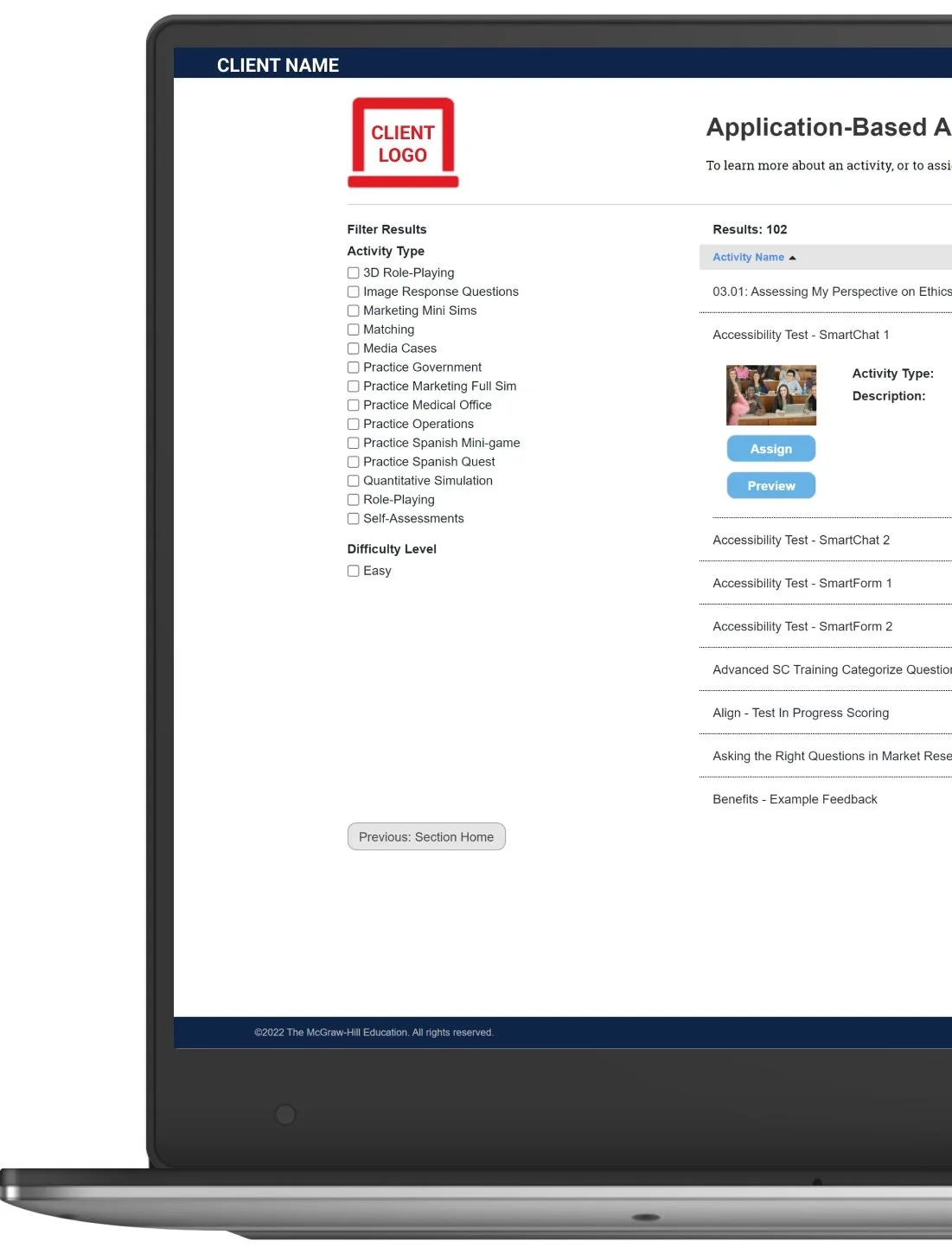
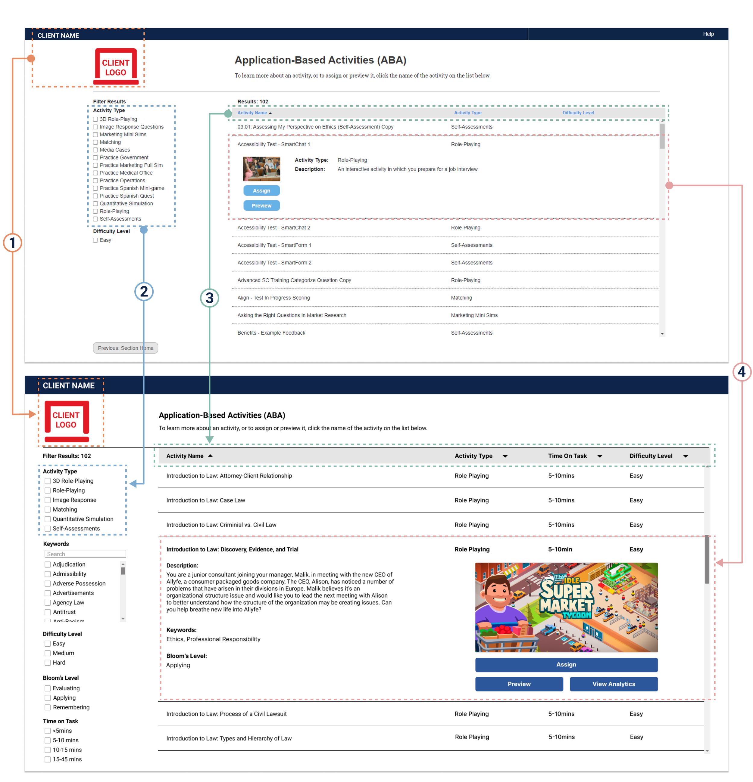
BEFORE
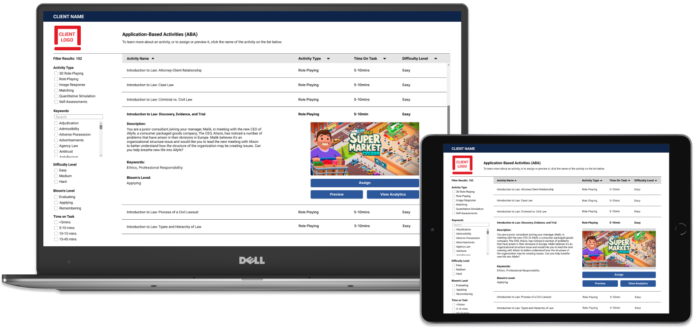
AFTER
01
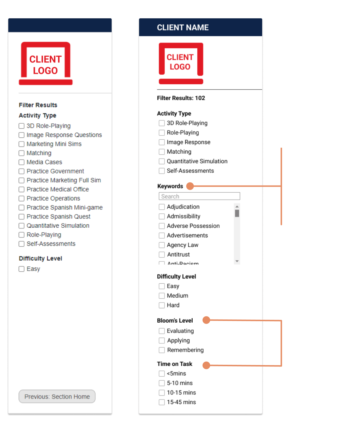
Left-aligned client name and logo with the "Filters" section for a polished visual composition and to improve readability.
02
Changed the activity types listed to reflect accurate naming conventions and avoid confusion
03
Replaced blue text (denoting intractability) with bolded text paired with a carat, a more widely used symbol to signify sorting results by order.
Added "Time on Task and Difficulty Level" as sortable columns to offer additional control, while allowing them to systematically work through the products in their preferred order
04
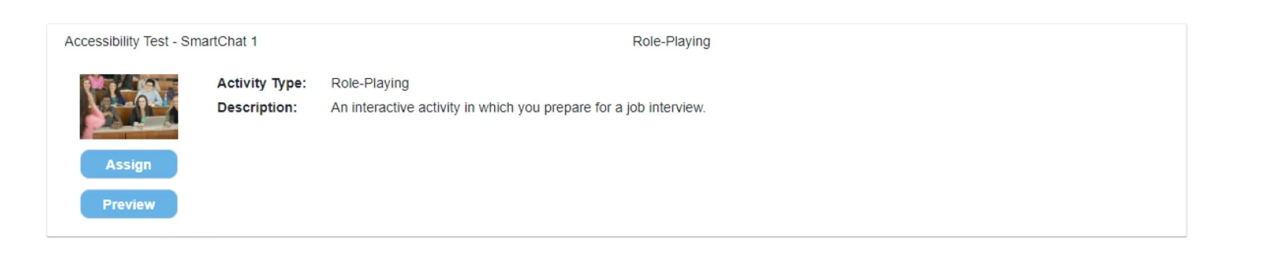
Increased activity image size to better market the engaging nature of the ABA feature
Prioritized the "Assign" button to emphasis it as the primary CTA
Added "View Analytics" button to market an added feature
Added information most relevant to users when deciding on assigning an activity (Bloom's level and Keywords)
UP CLOSE + PERSONAL
The Details
BEFORE
AFTER
Built a strong textual hierarchy with a predictable heading sequence (bolded when selected) for users to read without breaking the rhythm, and removed repetitive information
BEFORE
ENSURING SCALABILITY
Best Practice Guidelines
In order to ensure consistency throughout, I updated the internally facing interface to encourage all creators to upload 2:1 aspect ratio images, however to ensure retrospective feasibility and account for edge-cases, the developing team and I detailed that all other ratios would be held within a 16:9 container.
Added a Keywords filter to allow users to quickly and effectively refine their search. Allowing more passive users to browse and find content they may have not otherwise known about.
Added Bloom's Level and Time on Task as additional categories to filter by, allowing for a search experience that reflects what users think through when browsing assignments to assign.

AFTER
Changed button colors to accurately reflect the design system's button practice

THE VALIDATION
Measurable Success
We are aiming for the results page redesign to increase the conversion rate from those on the results page to those who assign an activity to 65%.
65%
CONVERSION RATE
LESSONS LEARNED
Clear Communication is Critical to Team Alignment
FINAL THOUGHTS
Half way through the project, we dealt with last minute scope creep which rushed certain aspects of the product in order to get it into the release. Thus, we learned to communicate more clearly by providing a roadmap early and setting stricter deadlines, while ensuring that any updates were communicated to the larger team as soon as possible.
Innovation Has a Time + Place
While considering alternative ways to design the filtering experience, many ideas were offered and considerable time was spent implementing them. However ultimately we decided to stick to familiar filtering conventions, as this part of the search experience should leverage existing mental models and not require the user to exert effort in trying to re-orient to a new filtering method.