
QUESTION-LEVEL ANALYTICS (QLA) DASHBOARD REDESIGN

Timeline
6 Weeks
August - September 2022

Tools
Figma
Miro
Zoom
78% of unresolved tickets are of instructors reporting usability issues and confusion around data charts
Business Problem
THE SOLUTION
THE PROBLEM
User Problem
Confusion on How to Track Performance Effectively
Low Confidence + Satisfaction using Product
Major Accessibility Issues
Provide a QLA dashboard that intuitively summarizes data while meeting accessibility (WCAG AAA) requirements
Overview
Muzzy Lane's instructor-facing Question Level Analytics (QLA) page displays a bird's eye view of an assignment, tracking student performance, summarizing score distributions, and communicating a detailed question and response table.
The existing QLA page showed significant usability and accessibility issues, difficulty interpreting the data charts, and poor visual UI design and hierarchy.
Role
UX + UI Design
UX Research
Negative Perception of Product
Missed Potential
Falling Behind Competitors
Low Satisfaction = Less Customers
THE RESEARCH
The following affinity map was outlined to help synthesize my findings:
Usability Testing
I conducted 5 moderated usability tests to better understand the instructor's QLA dashboard experience, specifically I wanted to assess their...
Objective in navigating to the QLA dashboard
Friction points interpreting the graphs and the questions and response table data
Satisfaction with the QLA dashboard
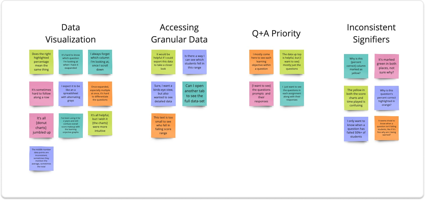
KEY TAKE-AWAYS
From Friction Points to Resolutions
RESOLUTIONS
01.
Homogenous Data Visuals
The sole reliance on the donut chart to accommodate different data types slowed the instructor's ability to interpret the data shown.
Within the question and response data, the lack of differentiation between questions and responses as well as inconsistent indentation when expanded made each row difficult to view and follow.
01.
Align different data sets with appropriate graphs.
Add subtle background color and consistent indentation to differentiate Q+A rows when expanded.
FRICTION POINTS + FINDINGS
02.
Accessing Granular Data
In-chart data is set at 10px, not only breaking accessibility standards, but illegible for 2/5 instructors tested.
02.
Irrelevant Information
Granular data shown within a hover state at 18px, so as to not over-crowd the visual. All in-chart data to be displayed at 22px.
03.
Hidden Q&A Table
While instructors found the data informative, 3/5 mentioned that they mostly wanted to review the questions and responses assigned- a table shown below the fold on their desktops.
03.
Ensure Q+A table is captured above the fold across different aspect ratios (16:9, 5:4 and 4:3)

04.
Inconsistent Signifiers
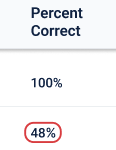
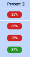
Confusion caused by the same color signifiers indicating two different functions...
a) within the percent correct column it indicated the varying intervals of students answering correctly
b) within the correct column it indicated whether a response was correct vs. incorrect
04.
a) Within the percent correct column, all colored signifers removed and replaced with a single red outline, as it was noted that instructors only care to be warned when a question is failing 50% or more of their students
b) Within the correct column, signifiers removed as their function can be deciphered through the adjacent column
THE IDEATION
Purposeful
Data and information can be represented in numerous ways, each serving a purpose.
The right pattern ensures that instructors can make informed decisions quickly and accurately
Design Principles

Simple
While data is king, over-crowding a screen will overwhelm users and cause them to lose focus of key information.
Making it critical to highlight the most relevant data and offer tooltips that communicate more detailed information as needed.
User Stories
As an instructor, I want to quickly assess overall class performance
As an instructor, I want to review the questions individually and view all responses
As an instructor, I want access to granular data


Accessible
Data visualization must be accessible. While a challenge, all accessible data visualization patterns created would be designed to fit seamlessly into Muzzy Lane’s style guidelines.
THE DESIGN
PEN + PAPER EXPLORATIONS
Lo-Fi Sketches
With my design principles and objectives in mind, I sketched a variety of solutions and began exploring a range of UI treatments that would effectively communicate the data and key metrics.
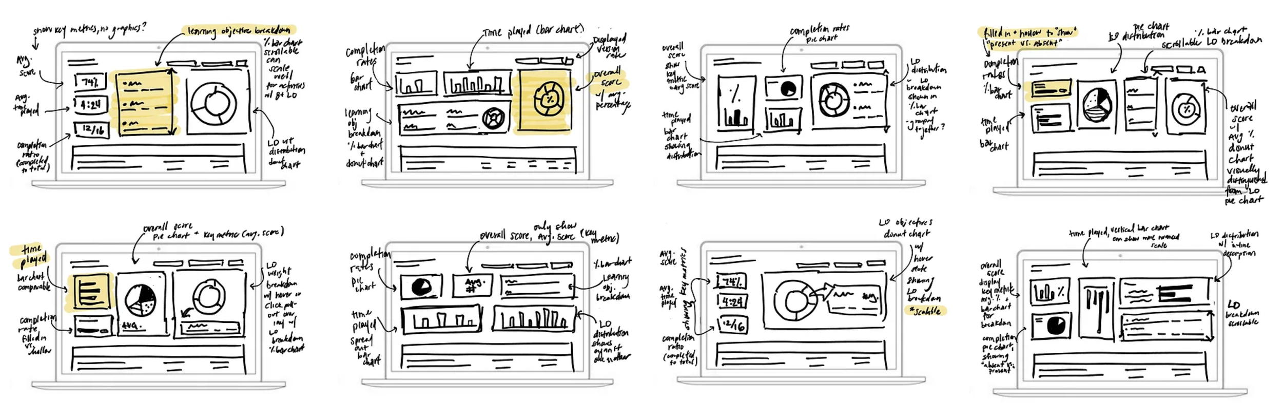
MEETING WITH STAKEHOLDERS
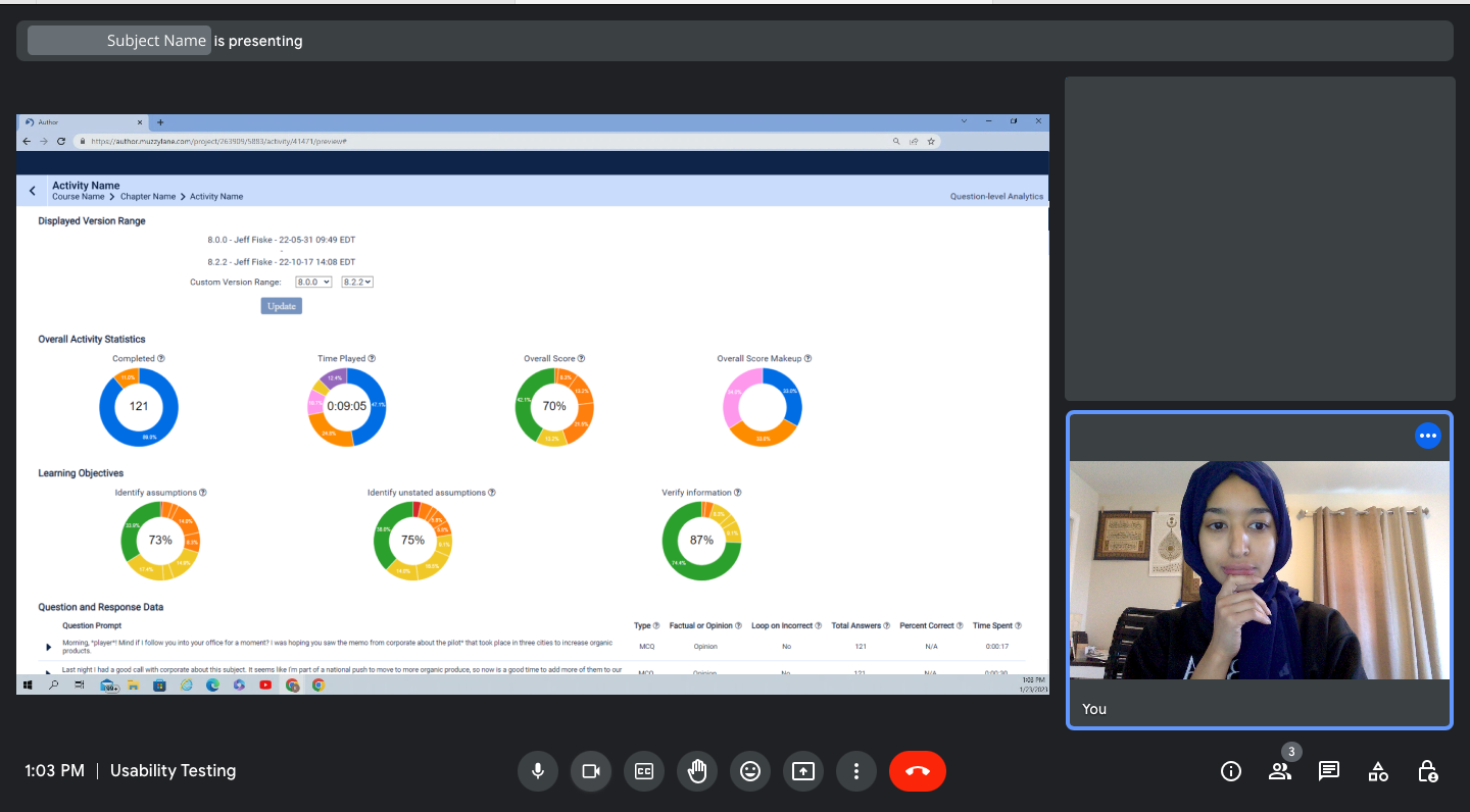
Mid-Fi Wireframes
After a round of dot voting on lo-fi wireframes, a mid-fi wireframe was developed with their insight in mind. I then met again with stakeholders and collected their feedback and noted any limitations from the developing team before moving to a hi-fi prototype.
BEFORE

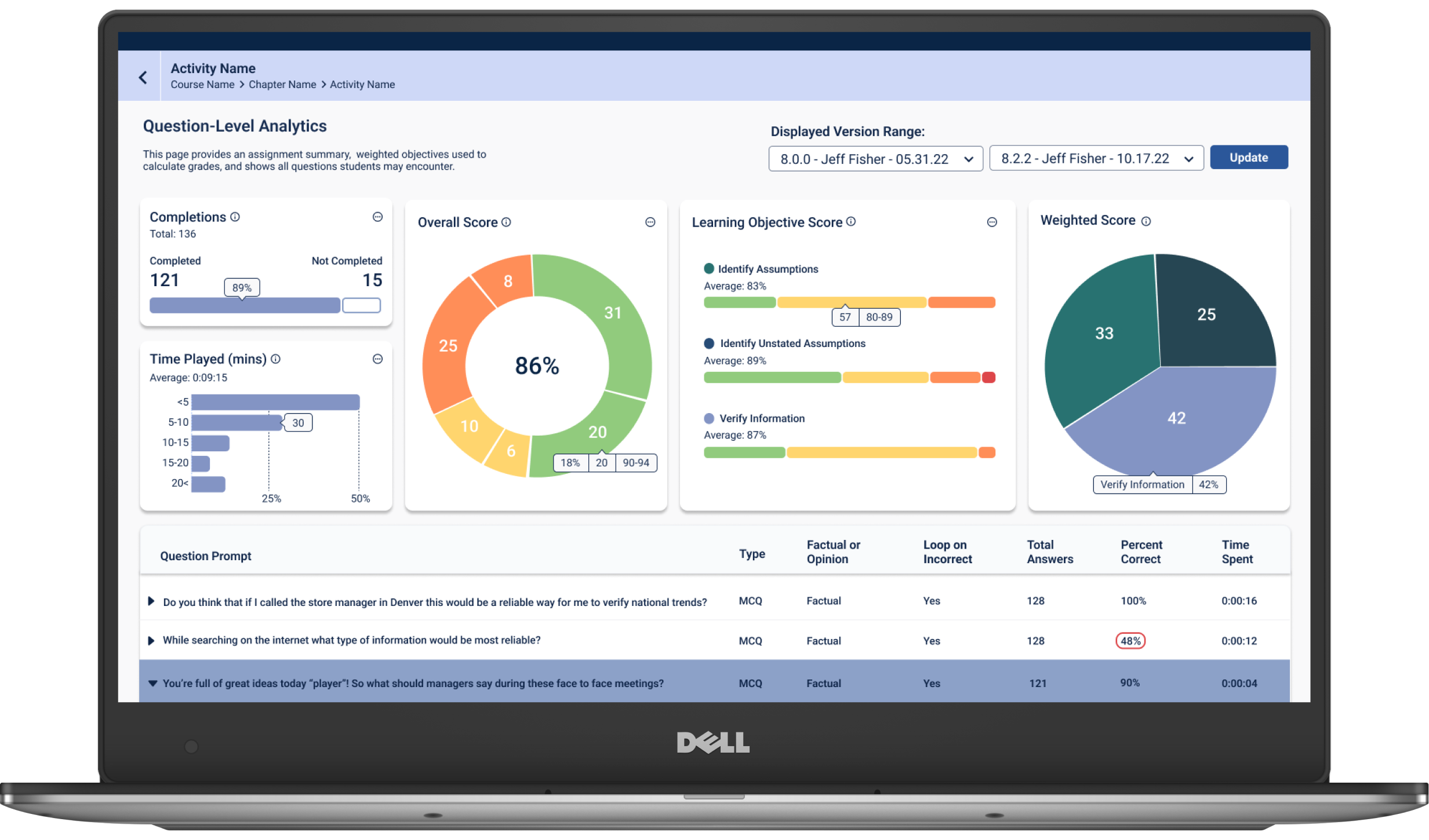
AFTER
UP CLOSE + PERSONAL
The Details
Adopted a card UI pattern to help instructors focus and intuitively connect related data points

Included hover states to highlight granular data. This keeps the visual from becoming over-crowded, while giving instructors control of the data presentation.
SAYING YES TO THE GRAPH
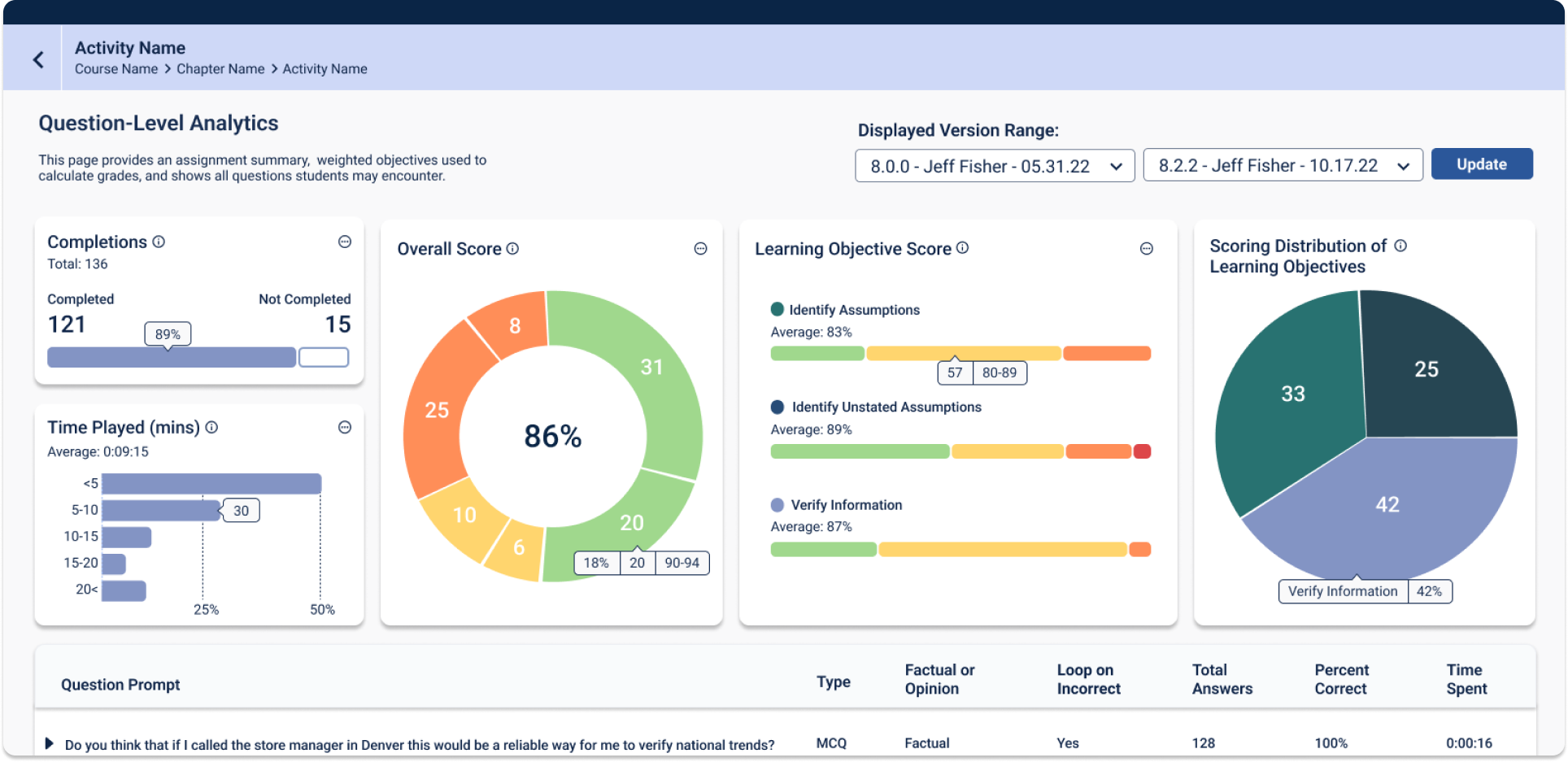
Data Visualization
When deciding on the appropriate visual or graph to communicate each data section, it was important to keep in mind the following:
1. What story is this data telling?
2. What are the categories?
3. How many variables? What is their relationship?
4. What's the appropriate level of granularity?


Added ellipsis icon to signify "More actions", namely "View Data" and "Export Data"
"Data is just a story told in numbers"
Completions
Text hierarchy to prioritize data most important to instructors
Percentage bar chart to capture dichotomous data
Solid and outlined bars visually communicate those present versus absent
Time Played
Bar chart, enabling instructors to compare the percentage of students within different time intervals, while showing the distribution
X-axis marks the percentages of students, rather than number, as this will remain constant across different assignments, easing the graph's learnability
Overall Score
Donut chart showing the distribution of scores and allowing a nuanced glance at the granular distribution within each score interval
Learning Objective Score
Percent bar charts for
a) highlighting the different grading groups set by instructors and
b) scalability, saving screen real estate by offering a scrollable list for when instructors use more than 4 learning objectives (LO), previously a single row displaying 4 LO would occupy 22% of the screen, multiplying as LO were added, which further pushed down the question and response data table below the fold.
Learning objective color matched to weighted score chart for ease of reference
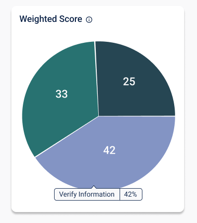
Weighted Score of Learning Objectives
Pie chart to show a parts-to-whole relationship, namely the weight each learning objective has within the overall score.
Adjacent to the "Learning Objective Score" chart to enable quick reference
6. Learning Objectives have an ellipsis, with a hover state to show the full title, allowing the design to scale when needing to accommodate multiple learning objectives, as well as shrink and expand across responsive states
7. Questions that are not scored within a learning objective now have hyphens to communicate the empty state, and not confused as a loading error
BEFORE

AFTER
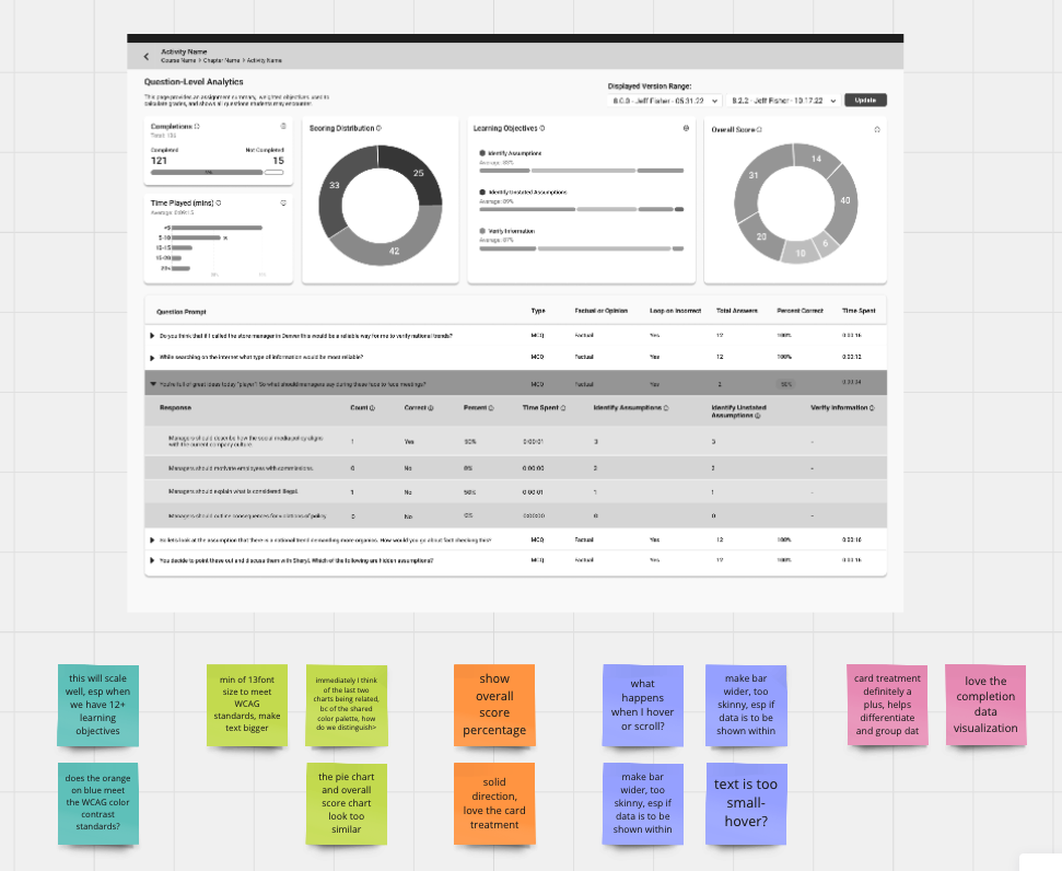
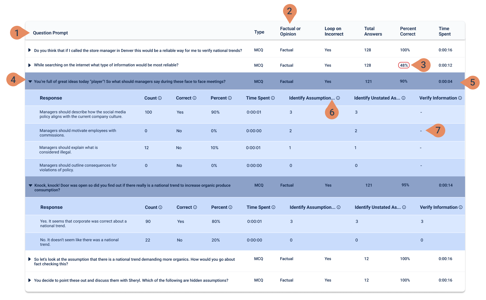
1. Added table UI pattern
2. Left-aligned all columns to ease readability
3. All color indicators removed except a red outline to highlight questions where 50% or more of students have answered incorrectly
4. Questions and responses are limited to 50%, 25% of table width before wrapping in order to allow for fixed column indentations
5. Expanded state now displays the question and responses within a colored background, easing the instructor's ability to differentiate row types. Alternating response rows are treated with a slightly differentiated shade to ease visual strain
THE VALIDATION
Measurable Success
In the quarter since the QLA dashboard redesign, the number of total unresolved tickets decreased by 55%
The percentage of those reporting usability issues and confusion around data charts decreased by 59%
59%
Decrease in unresolved tickets reporting usability issues and confusion around data charts
LESSONS LEARNED
Data is Just a Story Told in Numbers
FINAL THOUGHTS
Initially I began to choose the appropriate data visual according to variables measured and the level of granularity shown, although both are important guidelines, I quickly learned that more important was understanding the story being communicated and it's relevance to the instructor. This framework informs all other guidelines.
Choosing the Right Metrics
When meeting with stakeholders to set success metrics, we initially marked "Time on Page" and "Interaction Rate", however usability tests showed that an increase in these metrics didn't necessarily relate to increased engagement, but could correlate to longer time spent due to confusion around data visuals.
So while it's important to explore different metrics, it's critical that they are understood and validated from a user-centric lens to ensure accurate KPIs.