

Timeline
6 Weeks
June - July 2023
Tools
Figma
Miro
Teams
Low conversion rate of "Guest" to "Registered Customer" during checkout
User Problem
THE SOLUTION
THE PROBLEM
Business Problem
Low brand affinity
Higher attrition rates
Higher marketing and advertising costs

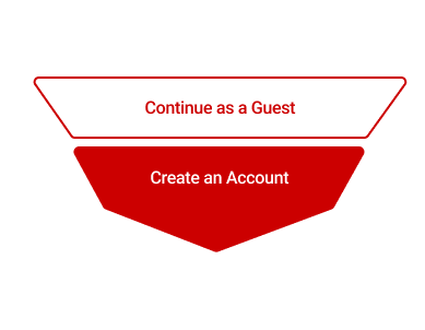
Boost retention by offering Post-Order Account Creation- the option to create an account after order completion
Cross-Functional Collaboration
Overview
The checkout flow is one of the most critical areas of an e-commerce site.
And while CVS has been successful in attracting visitors and converting them to customers, there has been an identified opportunity to further improve conversion rates among guest users during the checkout process.
Role
UX + UI Design
UX Research
Inconvenience of re-entering information each time
Inability to track order/slower customer support
Inability to see past purchases
Loss of rewards and promotions only available to registered customers
THE TEAM
While I led the UX design efforts for app, this was a collaborative effort that brought in:
Senior product leadership
One content stragetist
One accessibility designer
Two app developers
Input from dozens of CVS designers, design managers and developers
THE RESEARCH
UX Strategy
Given that 25% of users will abandon a checkout when forced to create an account (Baymard, 2023), business was firm in keeping guest checkout. So now the question became...
When during the checkout flow is it best to expose users to an optional account creation?
Mid-Order
01.
Don't Interrupt the Checkout Flow
Mid-order account creation risks distracting users with the urge to evaluate account benefits before completing their purchase, potentially increasing cart abandonment.
Delaying decisions until after the sale results in a smoother and more user-friendly checkout experience.

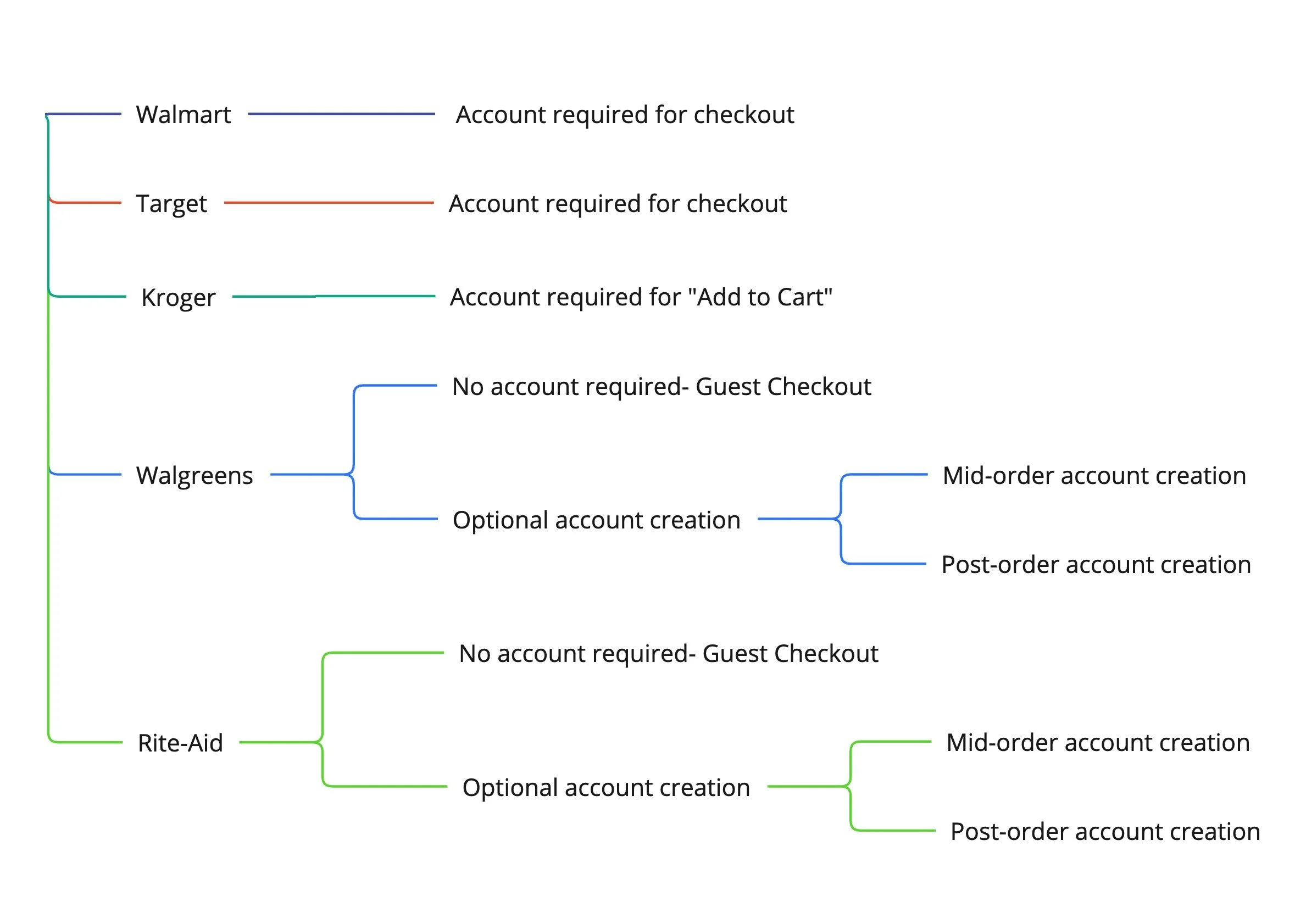
Competitive Analysis
In working to prioritize the design features and create a proof of concept prototype, I conducted a competitive analysis to understand trends within our competitors.
vs.
Key Findings:
3/5 competitors required account creation to checkout.
Those that didn't, offered the option to create an account mid and post order.
& here’s why…
Post-Order

02.
Mid-Order Account Creation is Perceived as Time Intensive
When users create an account at the start/during an order, they associate all subsequent form fields with account creation.
Post-order account creation eliminates this perceived friction, as the only form fields users will see post-order are 1-2 password fields. So while the actual checkout process remains the same, a user's perception of the friction is notably reduced.

03.
Users Can Be More Strongly Encouraged to Create an Account Post-Order
With the order complete and no risk of cart abandonment, have fun with it!
Now, the user's attention can be entirely directed towards styling and marketing that more actively nudges users into account creation.
THE IDEATION
Design Principles
01.
Be accessible and inclusive of all users
OKRs Alignment
Increase "Checkout Guest" to "Registered Customer" conversion rate
Do no harm to checkout experience, maintain or improve retail checkout rates
02.
Be scalable and flexible to evolve over time
03.
Be consistent with existing design system
THE DESIGN
Lo-Fidelity Sketches
With my design principles and objectives in mind, I outlined a variety of solutions and began exploring two flows.
Lo-fi prototypes showing different possible flows were then socialized across various teams (Account, Marketing, Legal, etc.) and updated with stakeholder input and technical limitations in mind.

In order to decrease tech debt, proposal no.1- which opened a component as opposed to a new page- was pushed forward.
While justifiable, from a technical feasibility standpoint, a round of usability testing would have shed light on which proposal was more usable.
Hi-Fidelity Wireframes
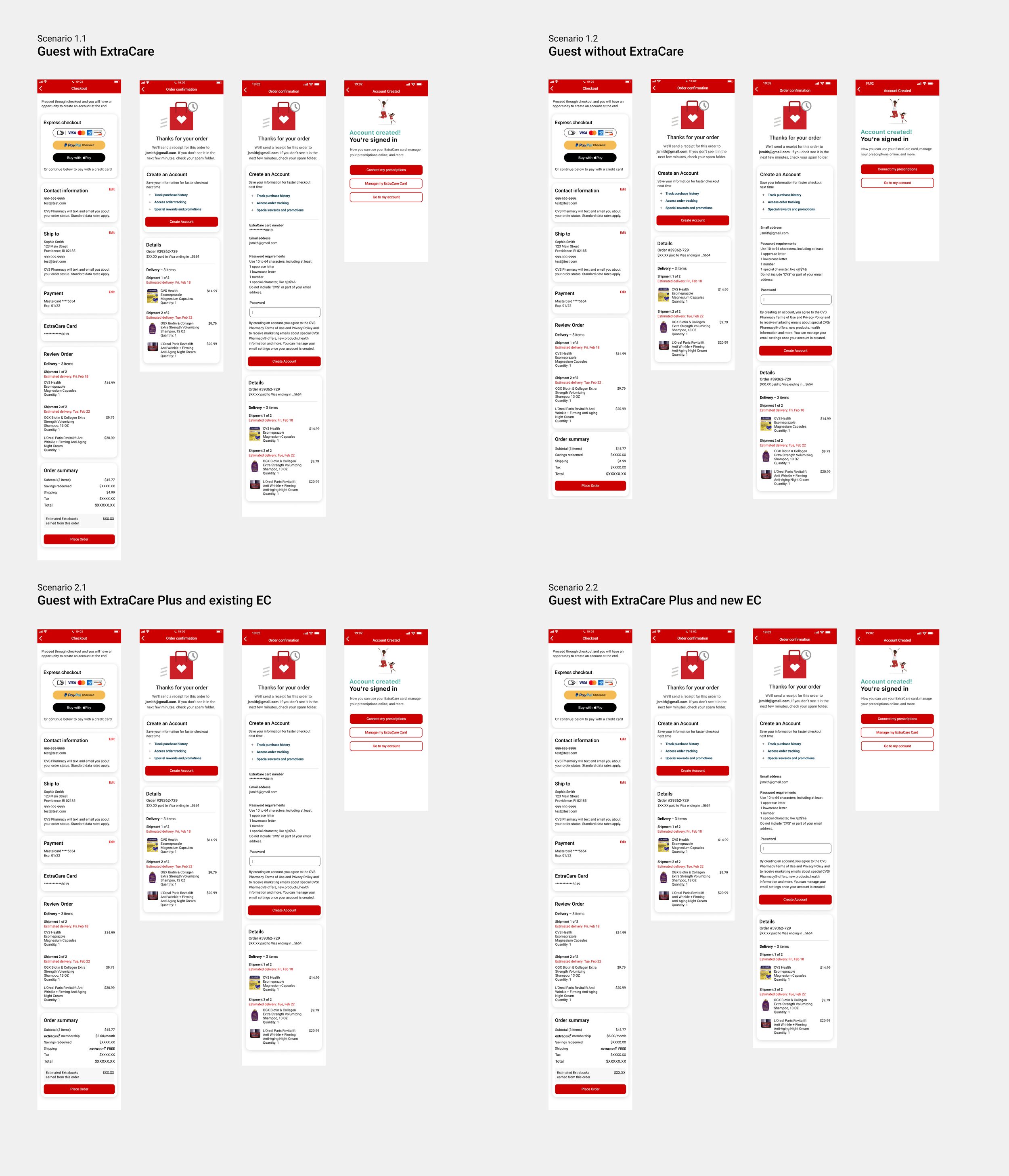
Weekly meetings across teams served to align marketing requirements with our users' key priorities. With final consensus and final copy ready, the following hi-fi prototypes were designed and presented.
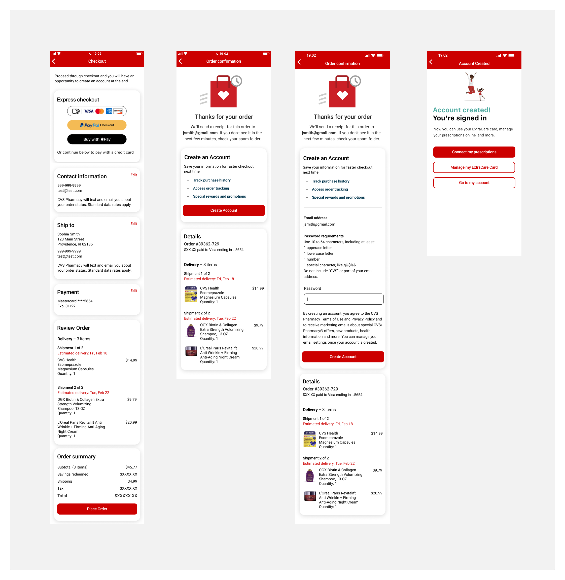
It is worth noting that while only one happy flow is shown above, dozens of other screens were designed to highlight happy states and error states.
Happy Scenario for Different Use-Cases
Guest with ExtraCare or ExtraCare Plus
Guest without ExtraCare nor ExtraCare Plus
Guest - ExtraCare Plus enrollment with existing ExtraCare
Guest - ExtraCare Plus enrollment with new ExtraCare
The Details
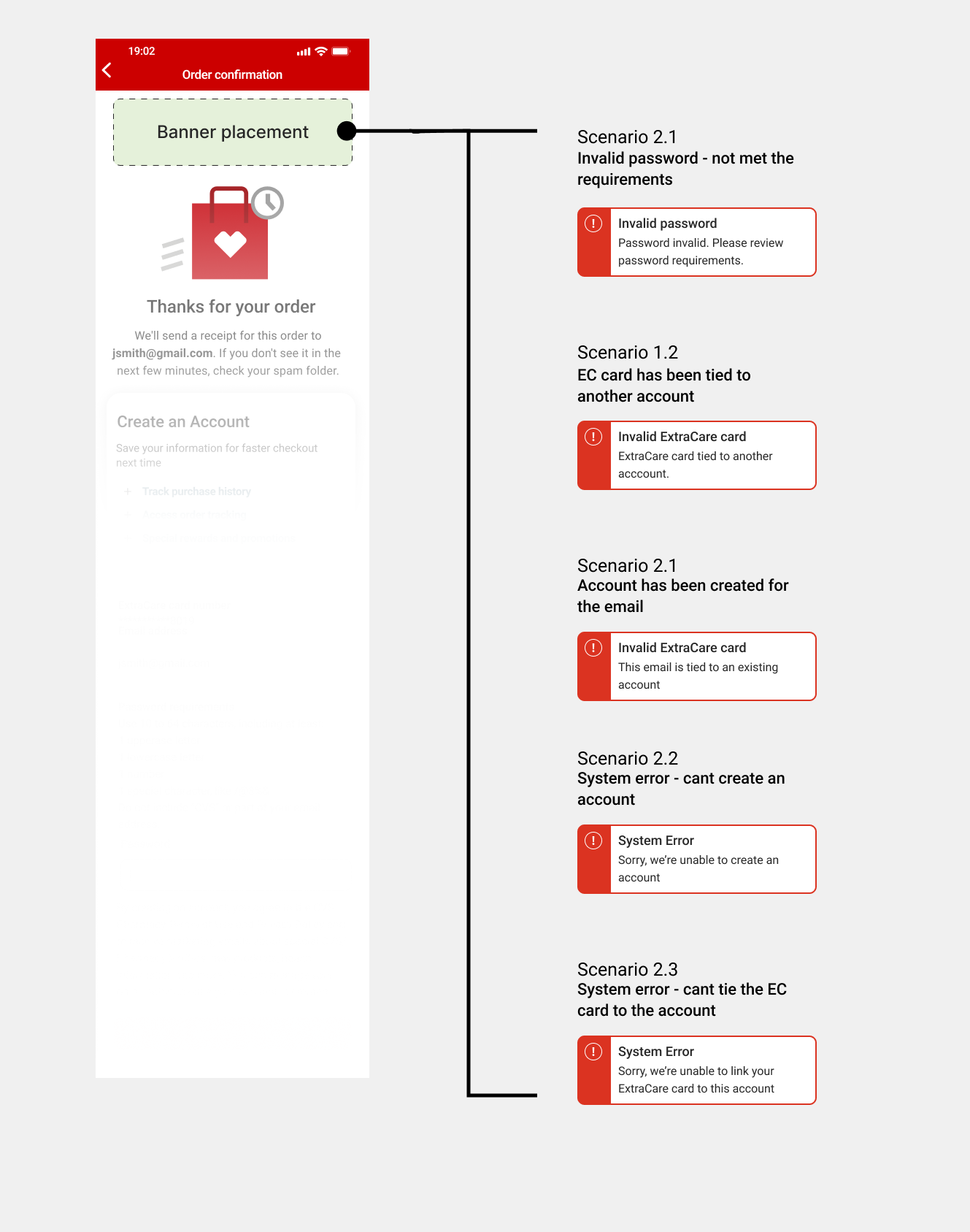
Error States
Invalid password - not met the requirements
ExtraCare card has been tied to another account (limit 5 cvs.com accounts)
Account has been created for the email (hide it)
System error - can’t create an account
System error - can’t tie the ExtraCare card to the account

UP CLOSE + PERSONAL
Copywriting:
Craft concise and compelling messaging that communicates the benefits of post-order account creation, while addressing user concerns.
Transparency:
Clearly communicate the data privacy measures in place, assuring users that their information will be securely handled.
Seemless UI:
Integrate the "Create an Account" option seamlessly into the post-order confirmation page. Use a visually distinct but unobtrusive design to highlight the option.
Incentive Presentation:
Clearly present the incentives users will receive upon account creation, emphasizing their value.
Minimal Friction:
Reduce registration friction by requiring a single form field.
Customization:
Inform users of their ability to customize their communication preferences, ensuring they have control over marketing emails and notifications.
THE VALIDATION
Monitoring Success
Once in production, it's important that we track performance, learn from results and iterate accordingly.
Specifically, post-order account creation rates will be monitored, with the aim of an increased conversion rate from "Guest" to "Registered Customer".
This will not only improved immediate conversion metrics but also lay the foundation for enhanced user engagement and retention through personalized experiences and value-added features.
Given the recent completion of this design, metrics will be updated when available.

LESSONS LEARNED
Accessibility Compliance
FINAL THOUGHTS
In striving to meet WCAG AA requirements, all designs underwent accessibility reviews, often times leading to design changes. In order to save time and design efforts, include accessibility teams early on in design reviews.
Synchronizing Timelines
Collaborating with various teams (legal, marketing, accounts, etc.) involved synchronizing review processes based on each team's availability. This experience was a lesson on optimizing my timeline to match the support and review windows of each team more effectively.